.webp)
Planr — Expert consultation platform for homeowners & architects
Built from ideation to production using Claude AI + VSCode no agency, no team.
Overview
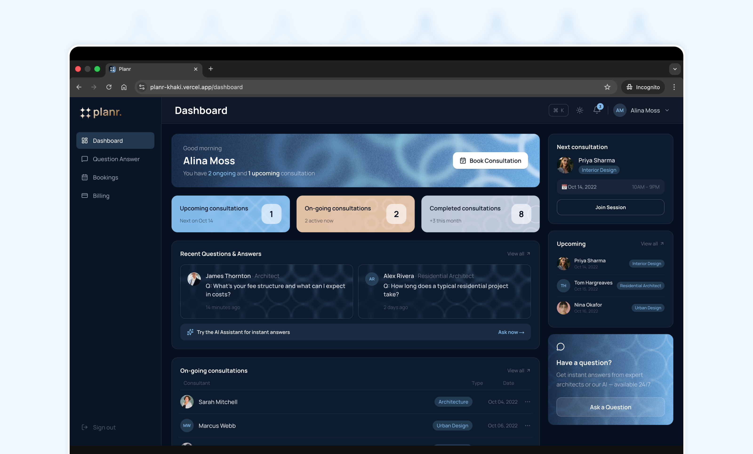
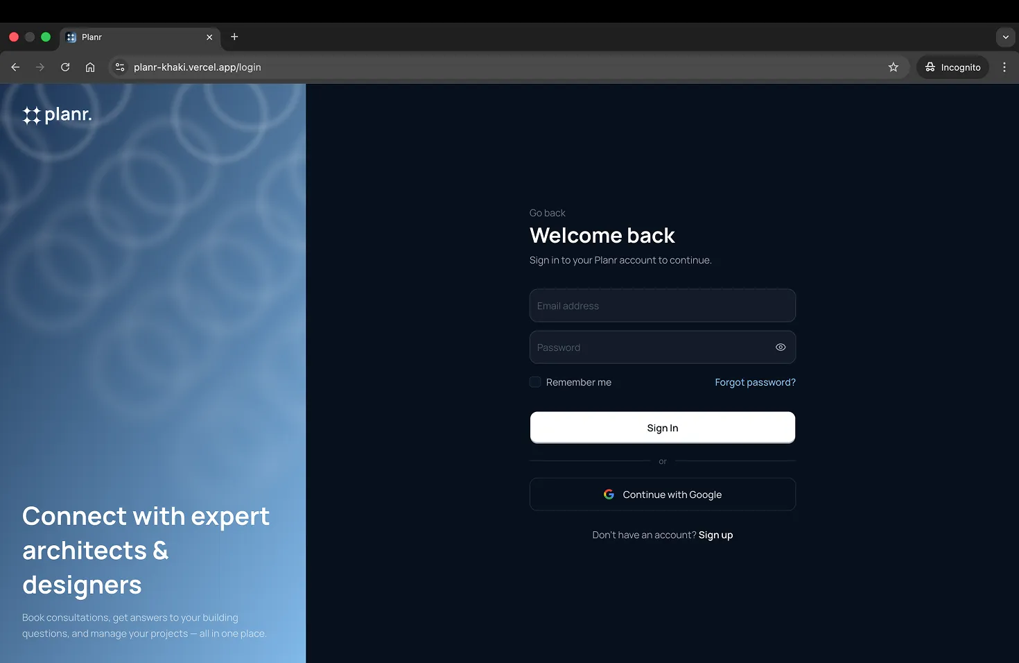
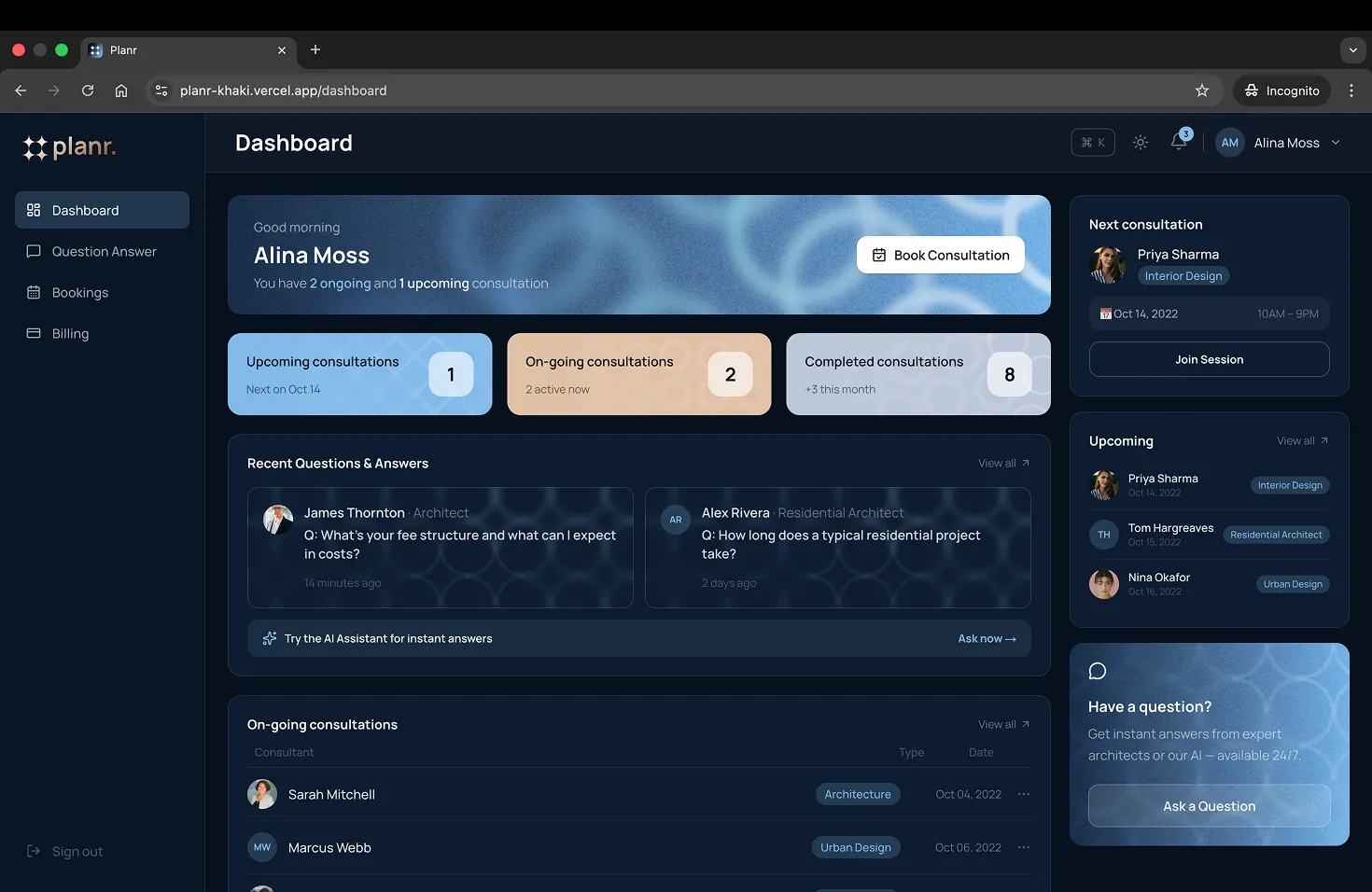
Planr connects homeowners with verified architecture, interior design, landscape, and construction professionals. Users can browse consultant profiles, book sessions, chat with experts, get instant answers from an AI assistant, and manage their consultations — all from one dashboard.
Problem
Hiring a building professional is overwhelming. Homeowners don't know where to look, who to trust, or what to expect to pay — and most platforms are either too generic or too expensive to access.
Idea
A focused platform where homeowners can instantly connect with the right specialist — book a session, ask a question, and manage everything in one place.
Process
There was no design brief, no wireframes, no Figma file. Every decision — from layout to component structure to UX flow — was made directly in code, conversationally, with Claude AI in VSCode. Features were described in plain English, built, reviewed, and shipped. GitHub commits happened after every meaningful milestone. Vercel deployed automatically on every push.
Outcome
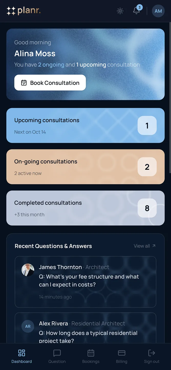
A fully responsive, dark-mode-ready, production-deployed application with 8 pages, mobile bottom navigation, realistic demo data, and a polished UI — built entirely through AI-assisted development.
Built with AI — how it actually worked
This project was built using Claude Code, Anthropic's AI coding assistant, running directly inside VSCode. It wasn't about asking AI to "generate an app" — it was a genuine back-and-forth collaboration throughout the entire build.
The workflow:
Describe a feature or problem in plain English
Claude writes the code, explains the decisions
Review in the browser, give feedback, refine
Commit and push when it's right
What Claude handled:
Component architecture and file structure
Responsive layouts (desktop, tablet, mobile)
Dark mode implementation with Tailwind CSS v4
Bug diagnosis and fixes (hydration errors, layout breaks)
What I handled:
Product decisions — what to build and why
Design taste — Design system build with brand
UX direction — user flows, interactions, feedback loops
Final review and quality bar
The skill isn't just in coding anymore —
it's in knowing what to build, and how to guide the AI to build it well.
Tech stack
Framework
Language
Styling

Components


Icons
Deployment
VersionControl

AIDevTool
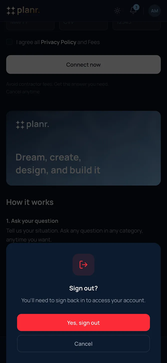
Key features
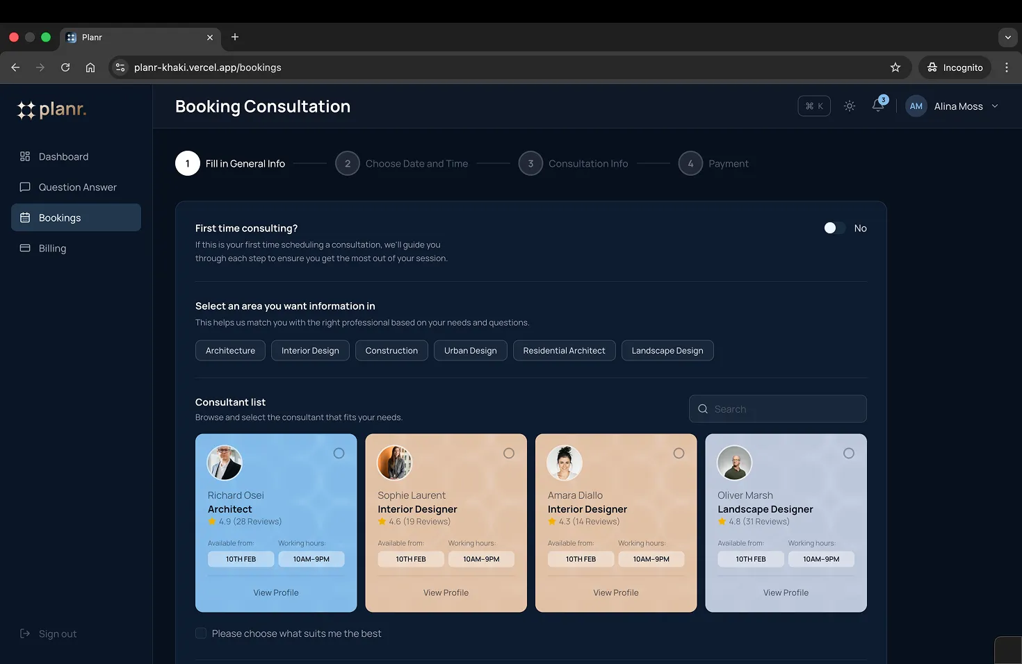
1.
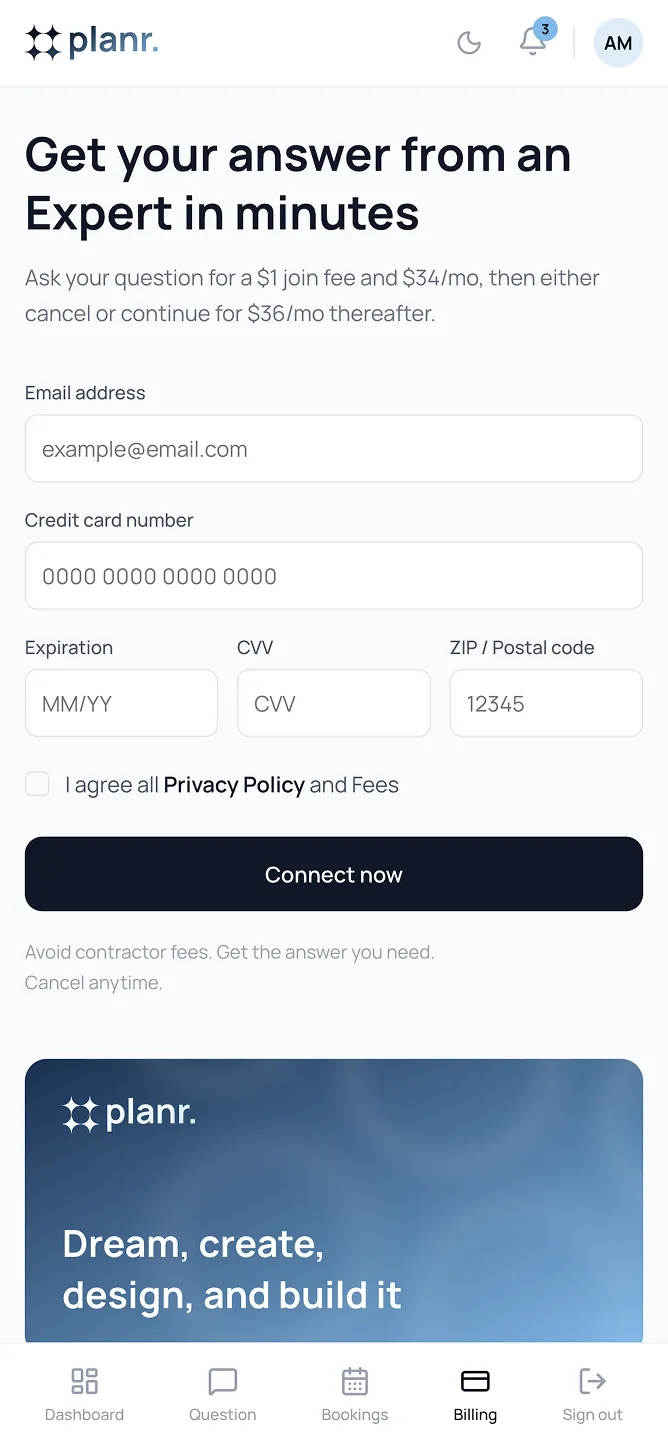
Multi-step booking flow with consultant cards, calendar picker, time slots, and payment
2.
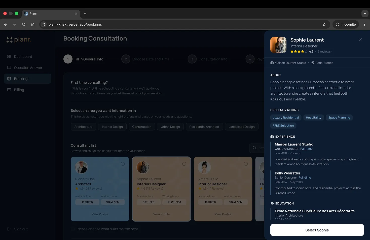
Consultant profile drawer — bio, experience, education, client reviews
2.
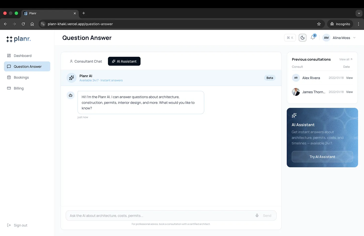
AI chat assistant with contextual responses
3.
AI chat assistant with contextual responses
4.
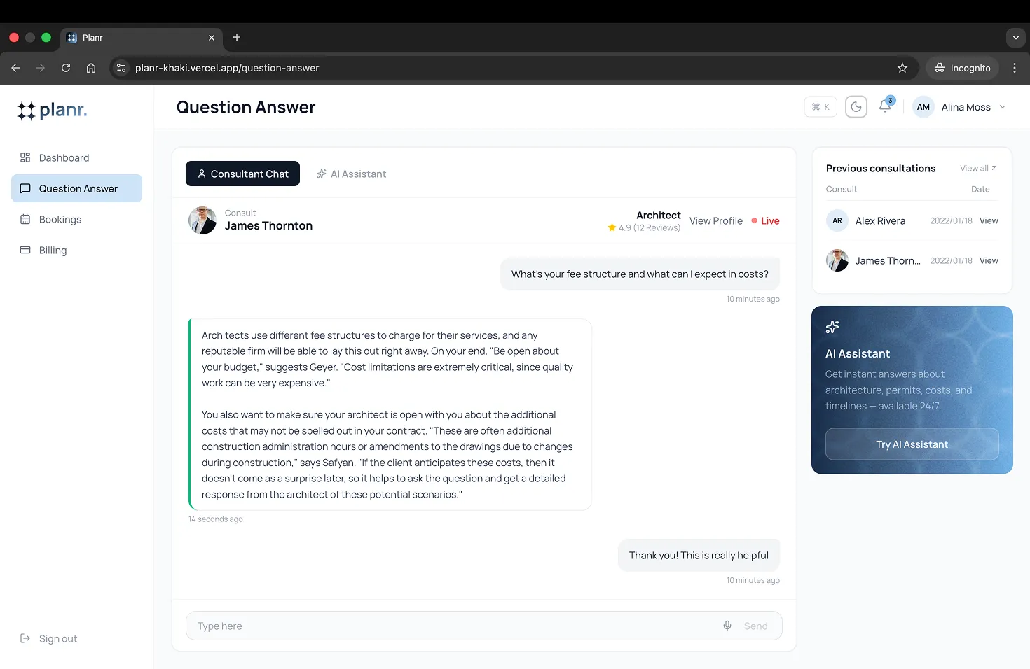
Live consultant chat with real-time typing indicators
5.
Dark mode with persistent theme across all pages
6.
Dashboard with stats, ongoing & upcoming consultations
6.
Fully responsive — desktop sidebar, mobile bottom navigation
Visual design & branding
The visual design of Planr was focused on creating a professional and clean interface that would be easy to navigate while being aesthetically pleasing. Focused on a balance between functionality and an inviting design for users and consultants alike.
Color Palette
The visual design aimed to reflect the professionalism and reliability of the platform, using a balanced color scheme of:
- 07111E: Signifying optimism and energy, this color was used to highlight important actions and buttons, drawing user attention to key areas of interaction.
- 81B9E9: This cooler, calming tone was used for backgrounds and secondary elements, ensuring a clean and minimal interface that didn't distract users from their primary tasks.
Typography
For typography, we chose a modern, sans-serif font that was easy to read and fit well with the platform's clean and minimalistic design. The font hierarchy ensured a clear distinction between headings, subheadings, and body text:
- Headings: Bold, large, and clear to help users identify sections quickly.
- Body Text: A lighter font weight, maintaining readability while complementing the minimalistic aesthetic.
Iconography and Visual Elements
Custom icons were designed for the different types of consultations (e.g., architecture, construction, interior design) to create visual clarity for consultants managing multiple clients. These icons were used consistently throughout the platform to reinforce usability and recognition.
Additionally, small, clean illustrations were used sparingly across the site to enhance user engagement without overwhelming the interface.
UI Elements
The UI elements were designed to be intuitive and user-friendly. Buttons, forms, and inputs were designed with a balance of simplicity and functionality: